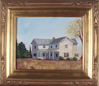
Pecking
 |
| "Pecking" 10" X 20" Oil on Hardboard |
I saw this photo over at Renee Lammers blog and wrote and asked her if she cared if I painted it. She graciously said I could. I will be attending Renee's art retreat in three weeks. I am really looking forward to it.
For my art friends:
I saw this blog post at The Sweet Adventures of Sugarbelle and thought it had cross-over appeal. It seems I am always struggling with photographing my art. I want it to be as close to reality as I can. i.e., this painting is showing up more yellow than the painting is in real life. I bought a painting recently that was VERY different than what showed on the monitor. The color saturation seemed to have been "jacked up" on the computer. To say the least I was very disappointed in the painting. While it was still a nice painting I had been drawn to it for the "color". I considered returning it. And I did contact the artist. She seemed to think it was my computer. I seriously don't think so. Needless to say I will not be buying any more of her art. But the good news is I have bought several paintings now, and I have to say I am THRILLED with most of them. They were professionally presented, professionally wrapped, and the best part, they were even MORE beautiful in person. So I won't let one disappointing experience keep me from buying more!
So anyway, I thought these tips were worth trying out. My big camera won't download pictures to the computer anymore. :( I think it was affected by a lightening storm. It was attached to the computer at the time.
Here is something I am trying. I have decided to try and use outdoor lighting for my pictures. One of the problems I have is having to lean the painting because it is usually still wet when I photograph it. This leaning causes distortions and I am always trying to match the lean angle with the camera angle.
This morning I made a picture holder that I can hang on the side of the house. It is on a north facing porch so there is no direct sunlight.

I made sure to use a level to make sure it was square with the world. I did not use a tripod but I think that would help. I would be able to line it up center. There is some distortion in this photo.
First off, the color is much more true. Second, because I'm using outdoor light, that is more intense even though it was early morning on a cloudy day, I got a much higher resolution. That is important if I ever want to make prints of any of my paintings. I will continue to play with this. I think it is going to help.

If you have any photo tips, I 'd love to hear them.

Contact me if you are interested in this painting. You can also see more of my available paintings HERE. Or, to see other paintings available at auction simply search Karla Uphoff in Art on eBay. Auctions start at just 1¢.

I love this painting Karla!!
ReplyDeleteI often worry that the colours are not right and many times I've retaken the photo or scanned them again.Thanks for the tips!!
Nice one, Karla. I especially like that golden glow.
ReplyDeleteInteresting post and I also struggle with matching the colors. The blues seems to jump out and red does not show the slight variations. Yellow is usually fine. This is a lovely one. You really captured the light.
ReplyDeleteThanks for your interesting blog about colors. I have done outdoor and indoor with overhead skylight. I just keep going until I can get close. The general opinion from the buyers so far is that the painting is better than what the monitor showed. I still worry though. Has anyone had any experience with the light box - a little square tent with the lights on the outside? I would love some feedback on them
Thank you Azra!
ReplyDeleteHi Diana! Thanks for stopping by.
ReplyDeleteHi Julie, Thanks!
ReplyDeleteMy camera seems to not like to see blue.
It is interesting photographing and I wonder how the changes from incandescent indoor lighting (which is so yellow) to the new "white" light bulbs changes things. Our paintings may look totally different in different settings.
Interesting post to read! Having worked in the graphic arts world for many years, I can say that the struggle of photographing color has been ongoing (& still going). And I have found that what works for one artist, doesn't for another. Light boxes are all over the place at the shop, and some computer artists can not work without one. While others run over to the windows on the North side of the building! In addition to the light differences, camera brands differ also. I find more "blue" in my photos with the Sony camera, than I do with my Cannon camera. (same was true back in film days, where Fuji film captured/developed differently than say Kodak film). And it is not only in color images, but black-and-white as well! And it is also true with scanners, not just cameras. For me, I take photos & then tweak them to match the live - of course, I am matching MY monitor to MY art based on how MY eyes see it. It will then be (hopefully) purchased by someone who will view it on THEIR monitor, with THEIR eyes, and hang it on THEIR wall in THEIR lighting! With so many variables, is it any wonder that we struggle? But then again, isn't that one of an artists quest - to "capture" the light! Ah, such a great topic, thanks Karla - I feel inspired now!
ReplyDeleteThanks Nan for your thoughts. Someone did a post once about calibration your monitor so you could be sure that you were seeing things accurately. Mine was off by a bit.
ReplyDelete