Pomegranate Take Two
 |
| Pomegranate Take Two |
7 X 7
Oil on Panel
This was a second take of the pomegranate using the color checker (see yesterday's post). I like the way this one turned out better than my previous attempt. I am learning as I go so I don't have to do quite as many adjustments along the way. This will be posted at Leslie Saeta's 30 paintings in 30 days for day 6. Still keeping up. But I'm afraid this week will be a challenge as I am baby sitting grand kids several days. I may have to get innovative.

I entered the challenge over a DPW which Carol Marine posted. We are supposed to do something new that we haven't done before. Well, I figured using the color checker was new enough for me to call it good. The painting I did for the challenge ended up being a HUGE challenge. I decided that I was going to pick the first thing that I saw on my still life shelves. These melmac cups were it. This photo is not good at all, but I called the painting "Chasing Melmac" because I literally chased that unique color of orange all the way around my palette. But I finally "got" it and there was a woo hoo!!
 | |||||
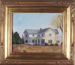
| Here is how today's painting might look framed. |
Check out some of my art!
Visit my Daily Paintworks Gallery. HERE

There is something regal about this pomegranate!! I love the set up and the colours sing!
ReplyDeleteGreat directional lines.
ReplyDeleteLove your choice for the challenge. It turned out great. Such deep rich colors. Beautiful
ReplyDeleteAmazing difference... I compared this to the pomegranate you posted on December 30. This one looks rounder and the colors and shadows on the tea towel look so natural. I have to make one of those color catcher tools and give it a try. Thanks for the tip! Good luck on your 30/30 challenge.:)
ReplyDeleteThis little painting jumps right off the page, Karla. Very beautiful! Keep up the awesome work, girl!
ReplyDeleteThe outer surface of a pomegranate is really unique, and I think you nailed it! Beautiful painting.
ReplyDeleteI really like the deep rich colors of the pomegranate on this one -- and it looks very natural, muted instead too garish. It would be interesting to see the entire series hanging together!
ReplyDelete